Hot Pockets.
Case Study: brand identity, packaging system & brand standards.
about
Created in 1980 by Paul and David Merage, Hot Pockets is a beloved generational snack that has cultural impact . With a cult following of gamers, comedians and internet memes, Hot Pockets is so hot, it will melt the roof of your mouth.
creative team
In-House Strategic Design: Tom Davie
Design Studio: Interact Brands
Brand Identity Lettering: Lux Typo.
Product Photography: Wright Studio

BRAND identitY
As a leader in the vintage fashion, subculture and re-issue markets, Byronesque required the need for primary and secondary logotype marks. The primary mark is used in mastheads and instances of high visibility, while the secondary is reserved for collaborations and occasions of limited space. The marks were developed using the following three themes and mood boards as a guide.

photo © Nestlé USA
PACKAGING
Byronesque has authored dozens of online editorials, focusing on rare designer vintage and the history behind collections and designers. These spreads are from the editorial Back Story, which showcases an inside-out look at prominent pieces available on the Byronesque app.
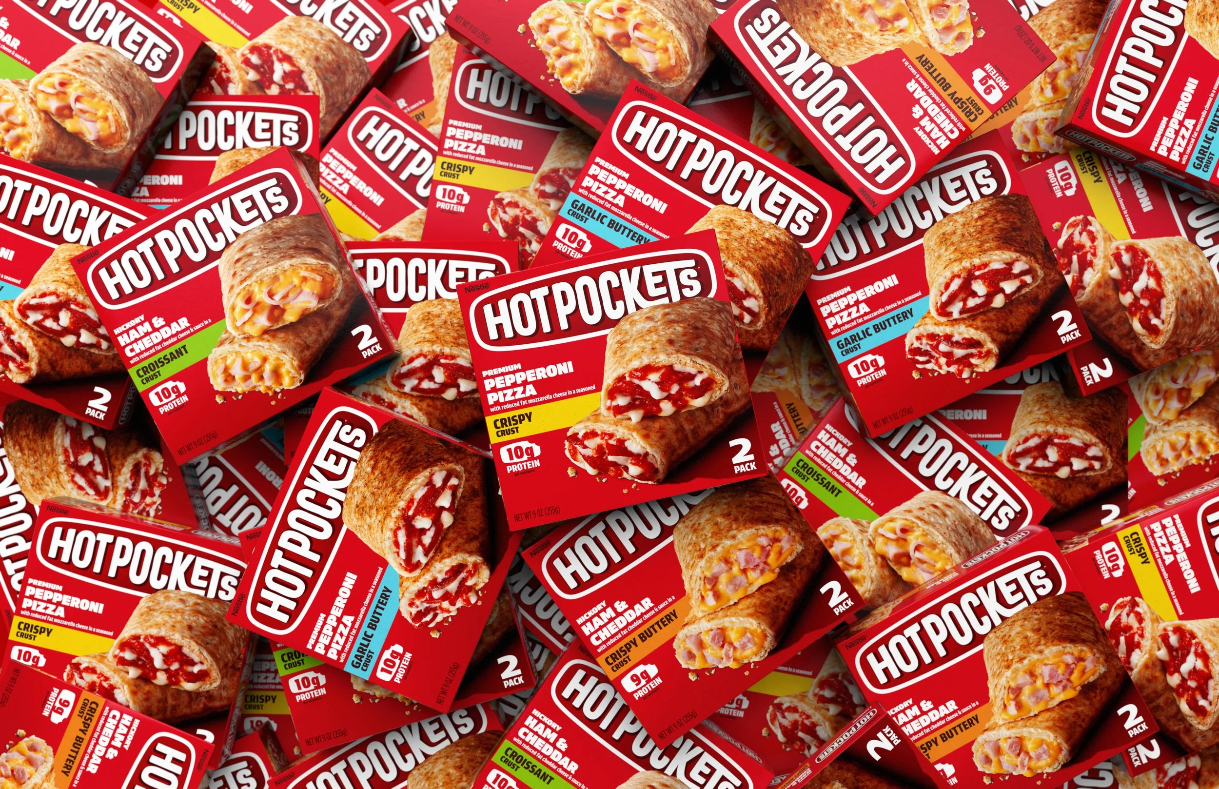
photo © Interact Brands

photo © Interact Brands

photo © Interact Brands
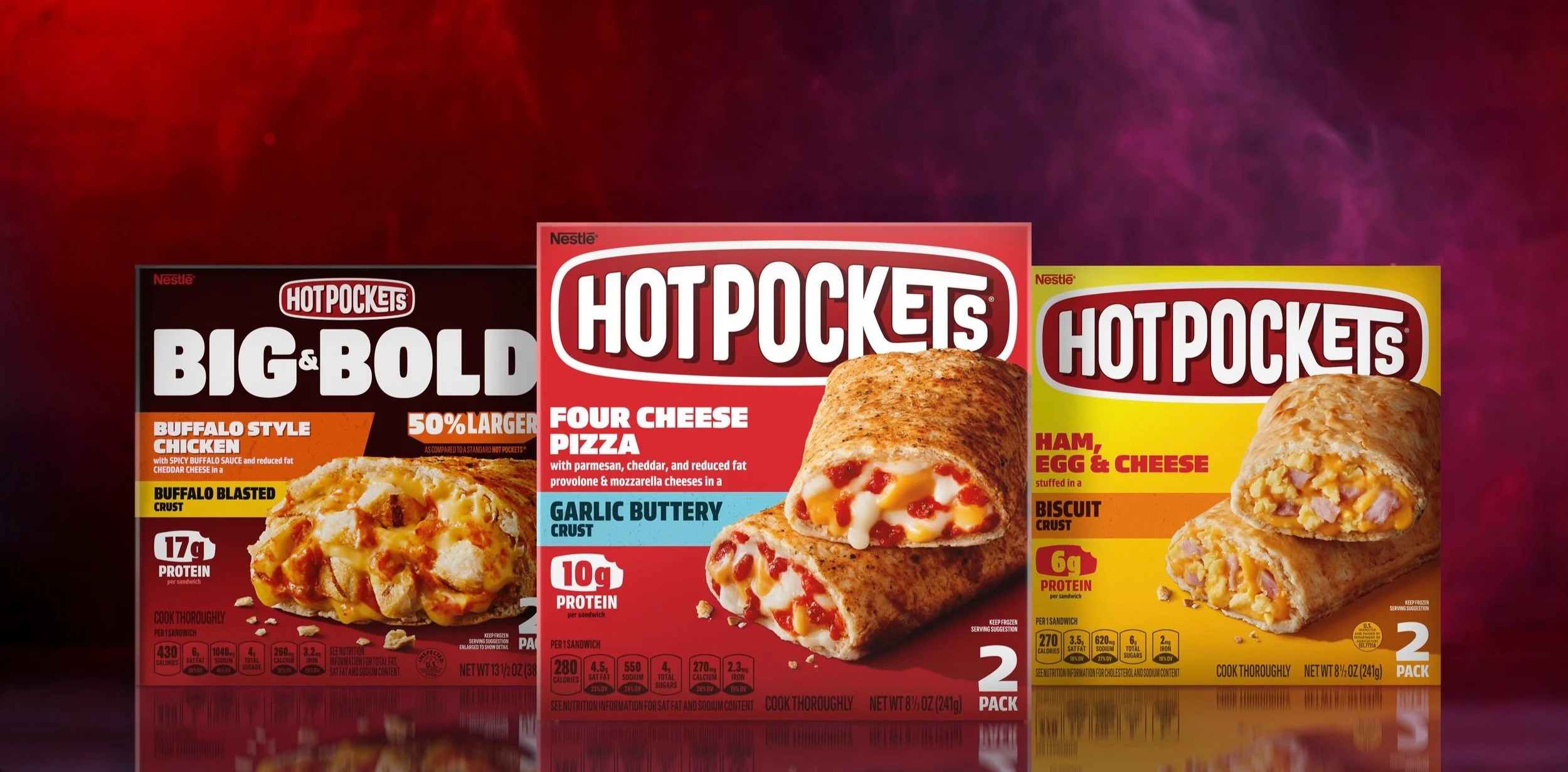
photo © Nestlé USA
style guide
The Byronesque brand is unapologetic, confident and functions as both an industry innovator and fashion partner that often involves complex collaborations. It was necessary that the style guide encompass this range of needs and clearly communicate how the brand elements were to perform.
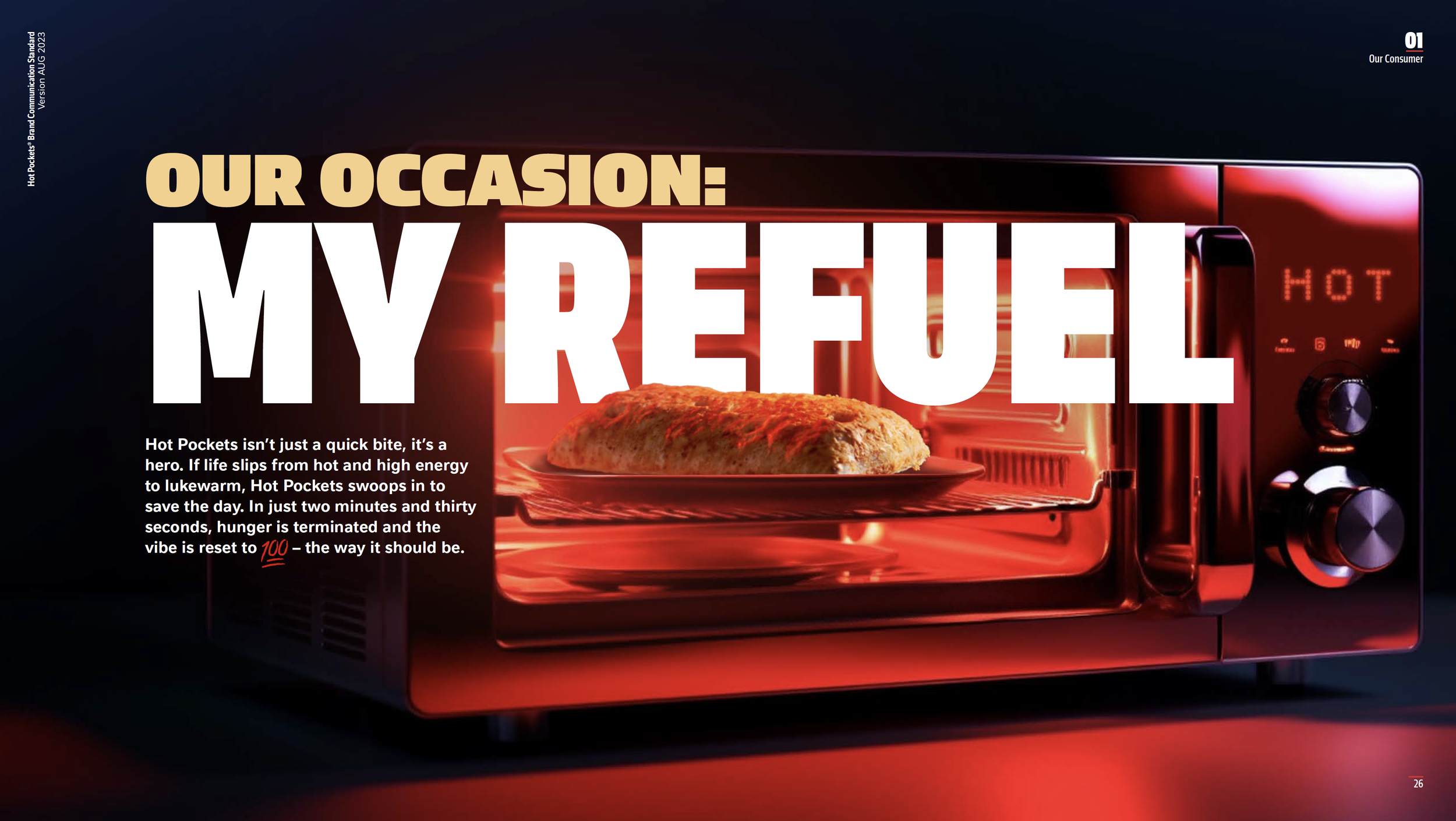
© Nestlé USA
© Nestlé USA
photography
The app is the primary portal through which clientele can browse current inventory or request an item from a specific designer and collection. The desktop site functions as a platform through which Byronesque editorial, stockists and fashion collaborations may be accessed. The UI is intentionally raw in its starkness, allowing the message and photography to engage the user.

photo: © Paul Jung

photo: © Joe Gaffney


photo © Derek Ridgers


strategy
In collaboration with Life in Perfect Disorder, a ”Dream Team” collection of nine influential vintage fashion icons were identified and honored through this series of designer shirts. Each tee is authentic vintage with custom screen printing, foil stamping and leather appliqués. Each authenticity tag was letterpressed and hand numbered.


photos © Justin Westover
